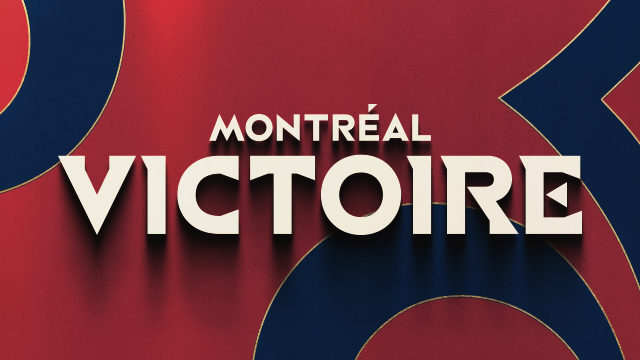
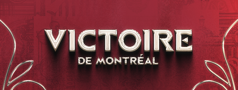
Montréal Victoire 2026-27
I’m currently leading design and creative direction for Montréal Victoire’s fourth season, following my work leading the team’s visual direction for the 2026 Walter Cup Championships.
P.S. No, I don’t speak French. Yes, I was very brave and made these graphics bilingual anyway.
Playoffs Package Selects
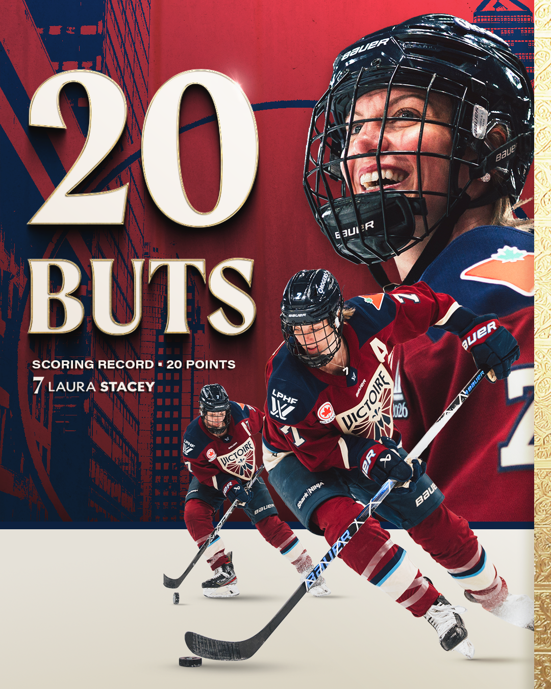
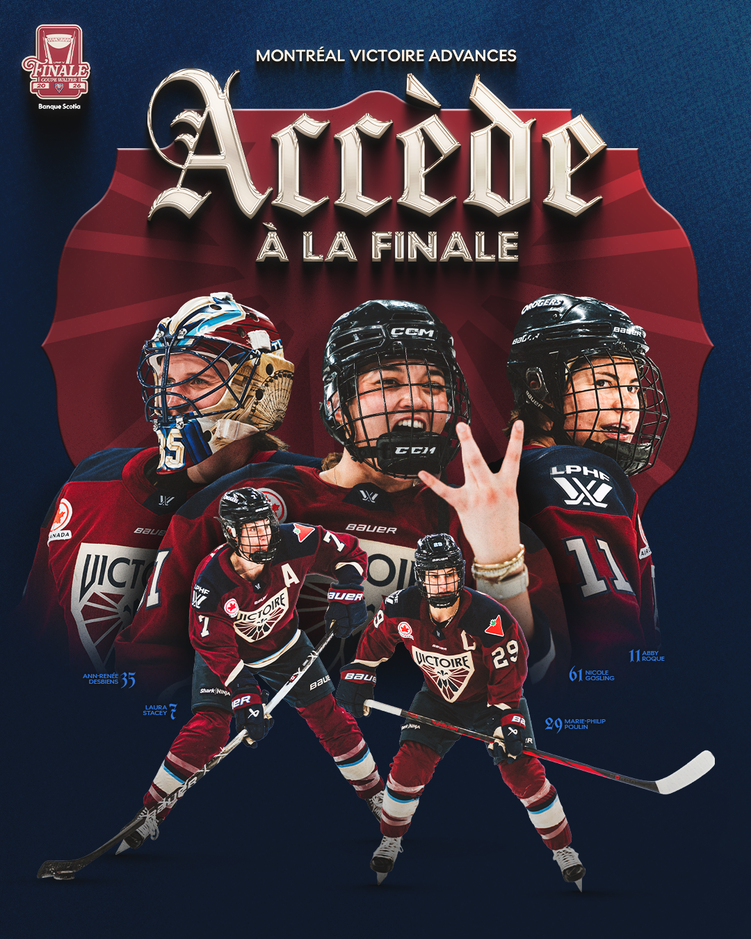
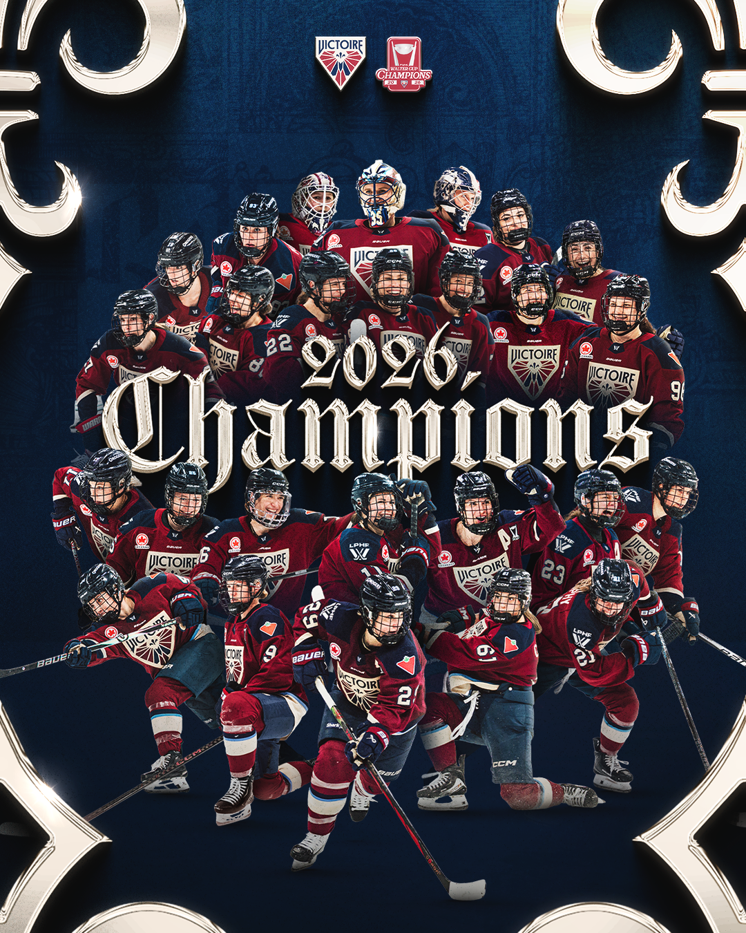
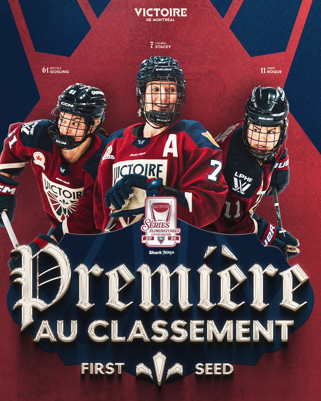
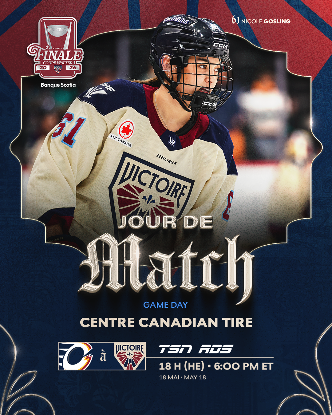
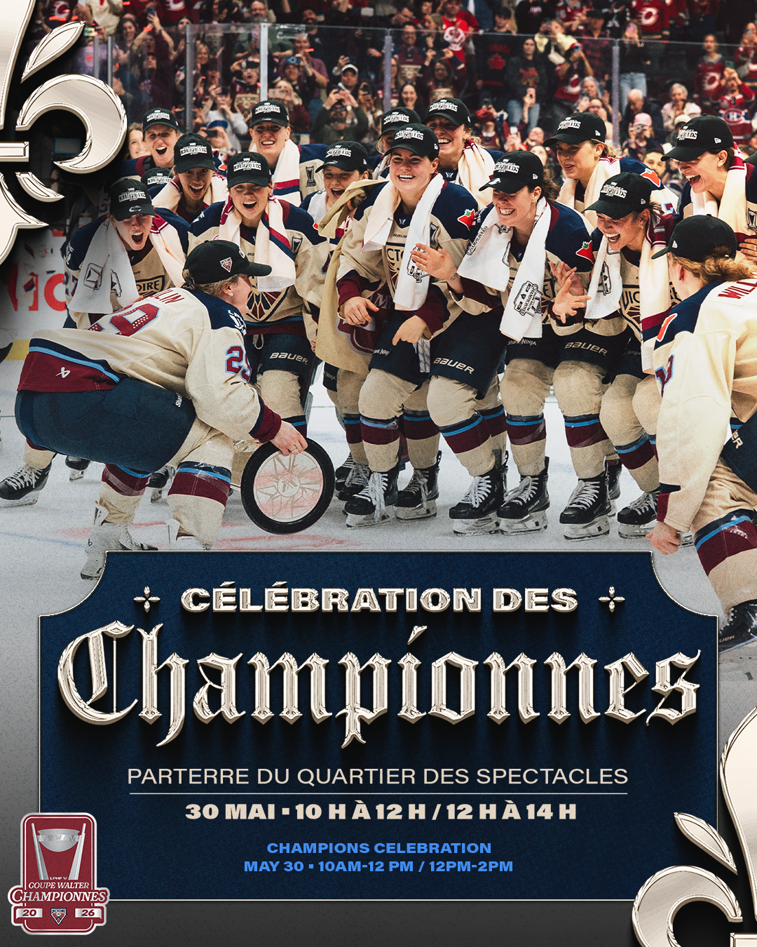
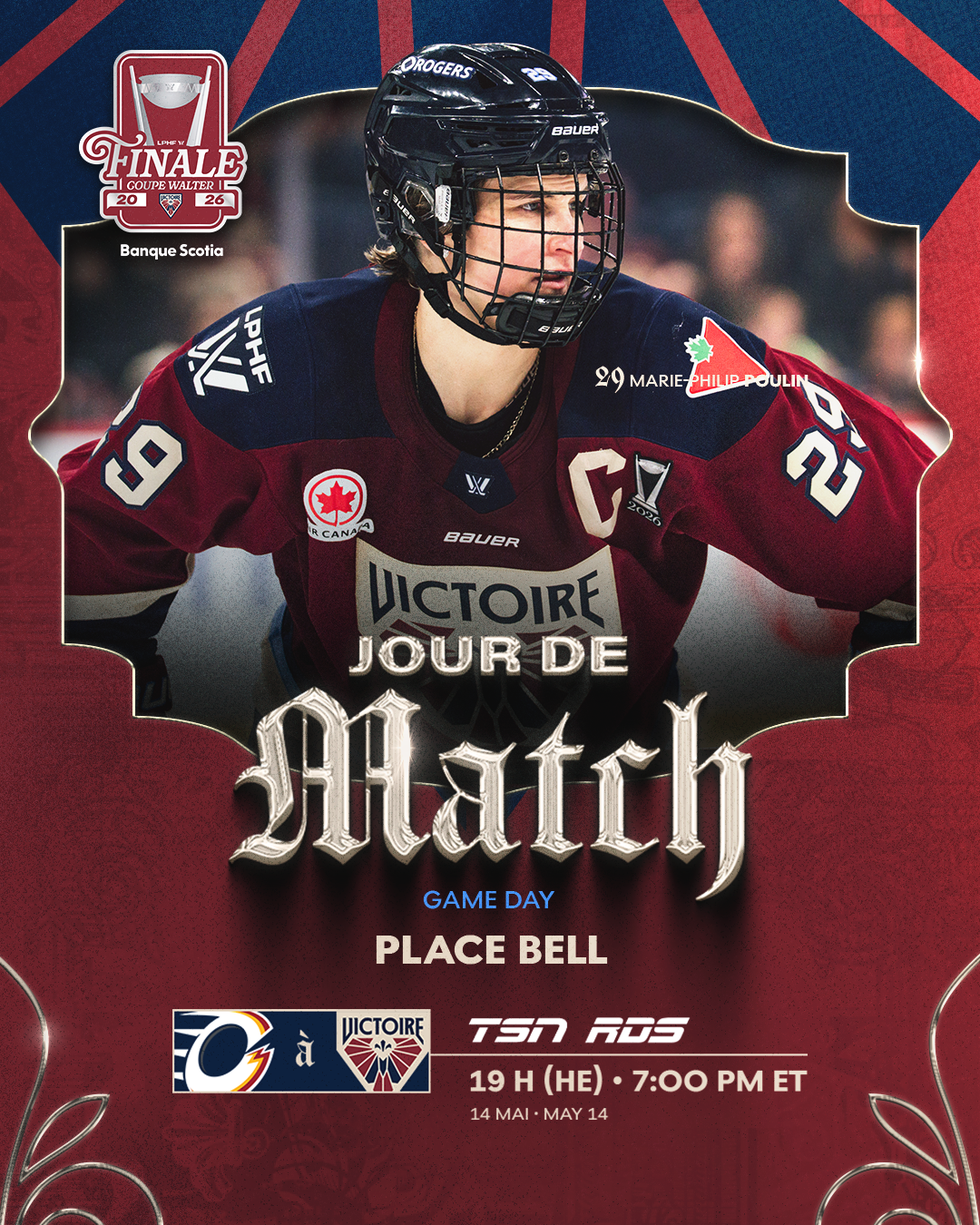
From the top seed to lifting the Walter Cup, this package covered every stage of Montréal Victoire’s 2026 playoff run. The goal was to give the postseason its own elevated look while keeping the system flexible enough for fast turnarounds, multiple formats, dense copy, and a playoff logo on every asset.
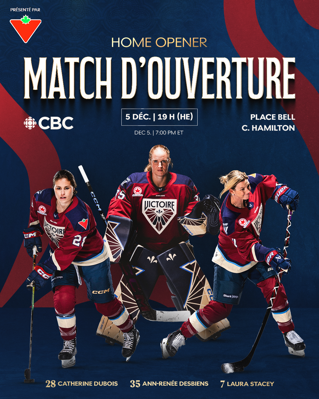
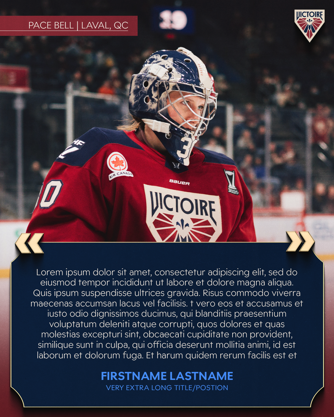
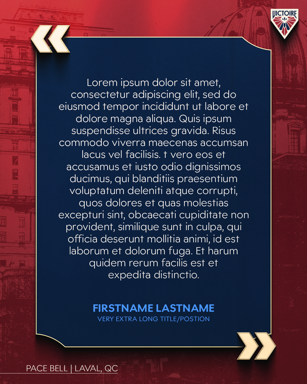
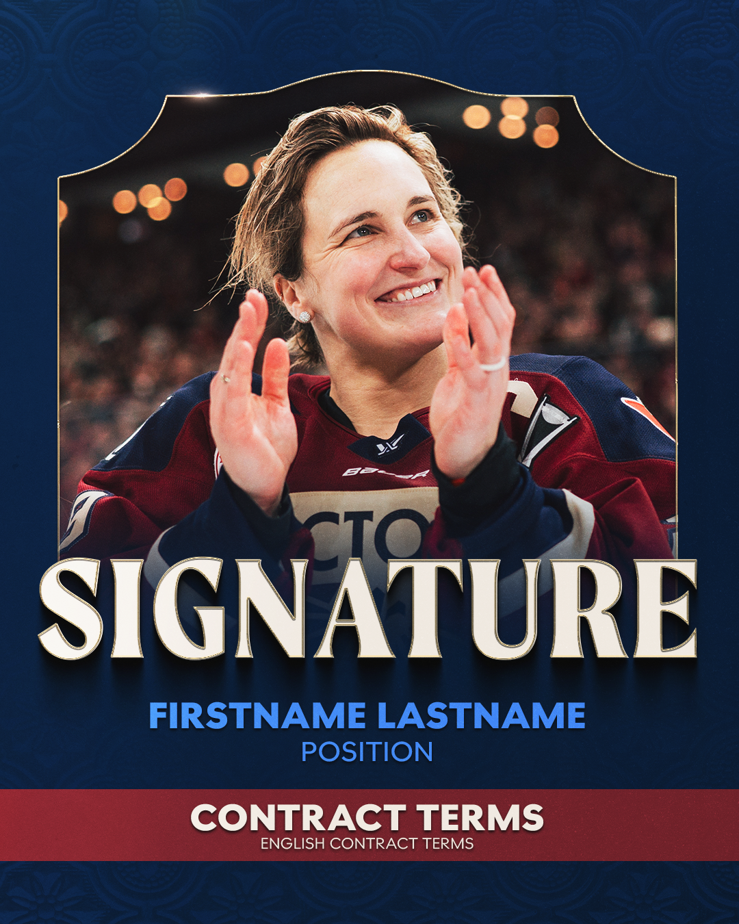
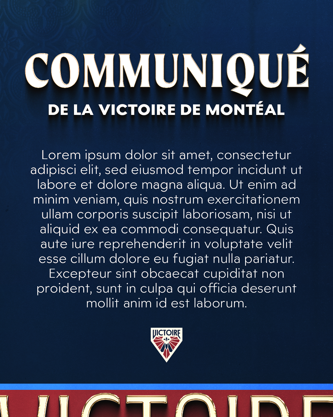
Social Templates
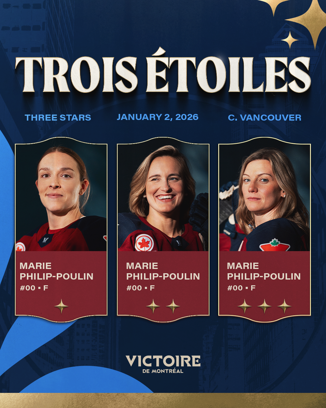
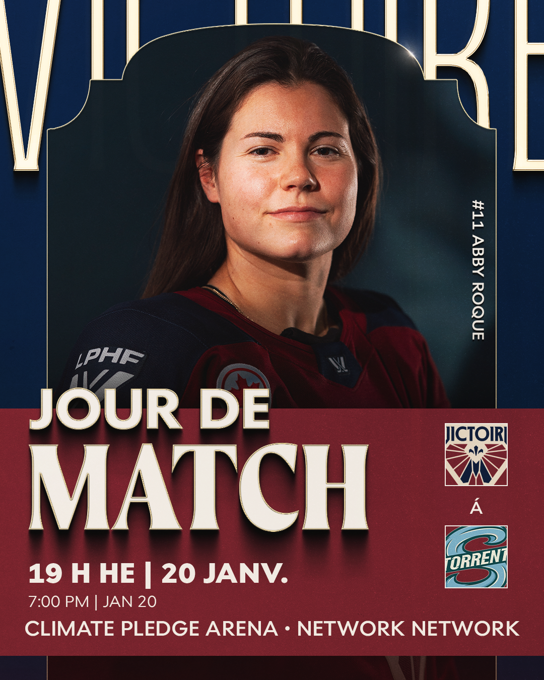
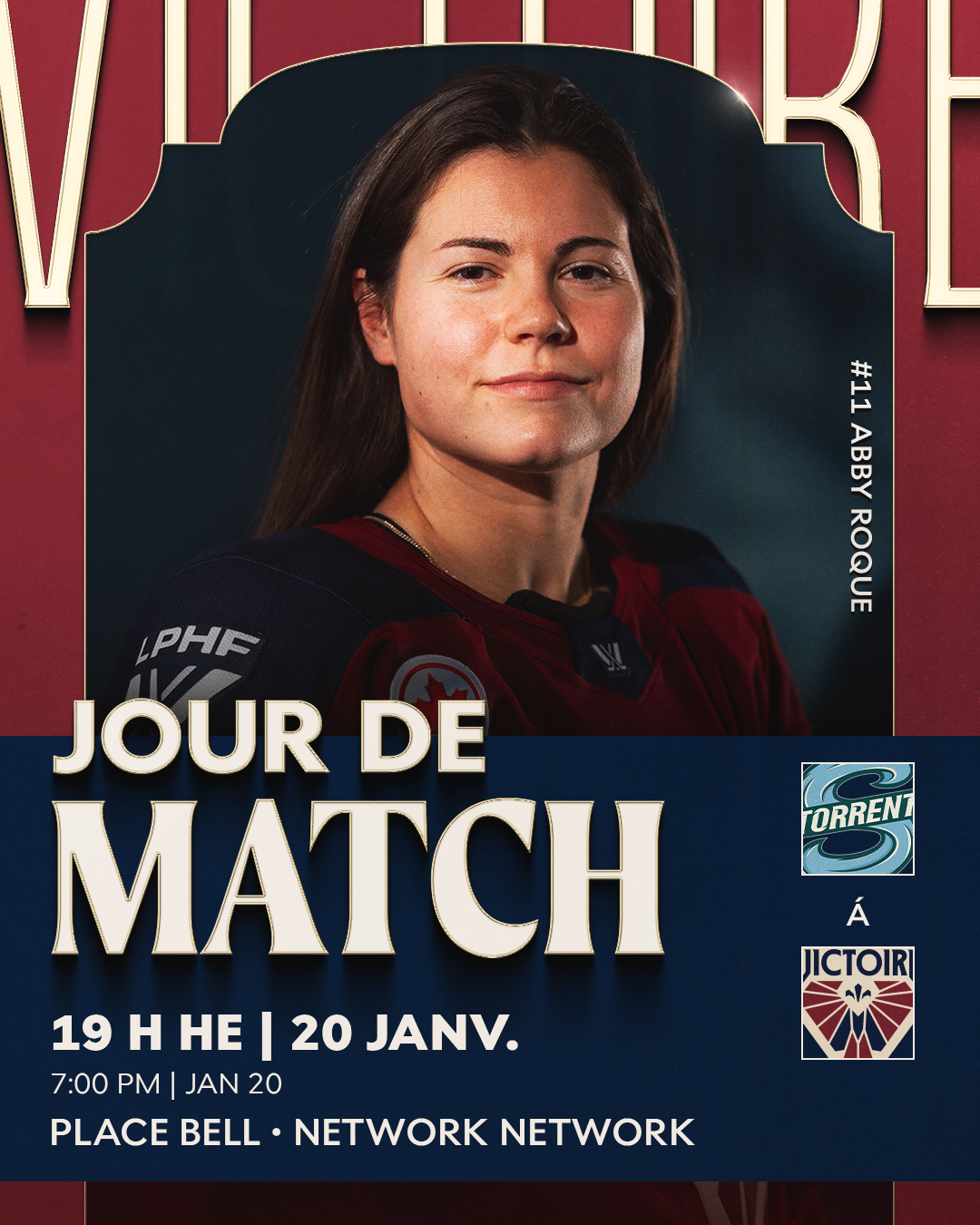
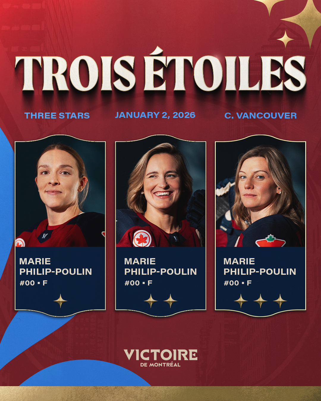
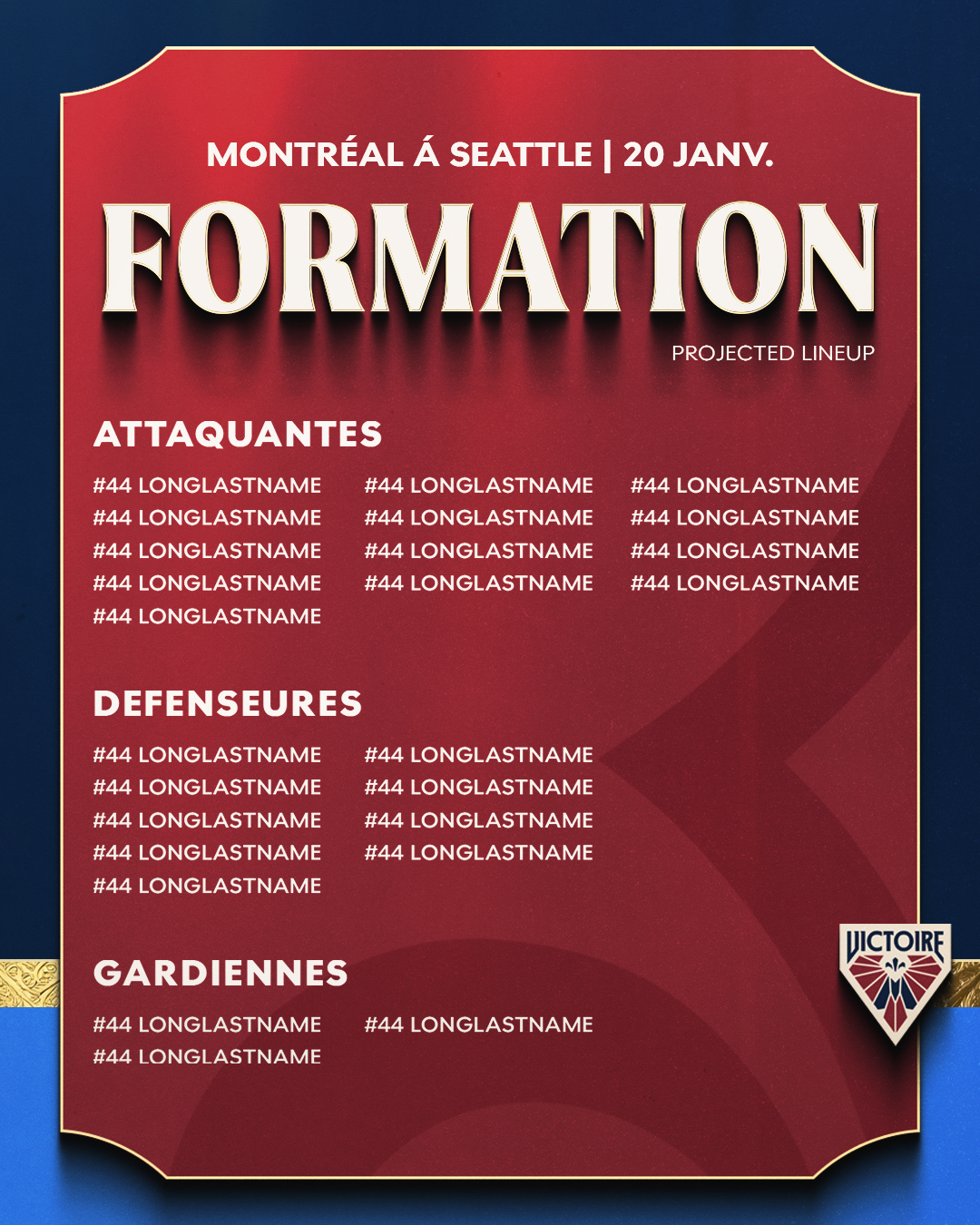
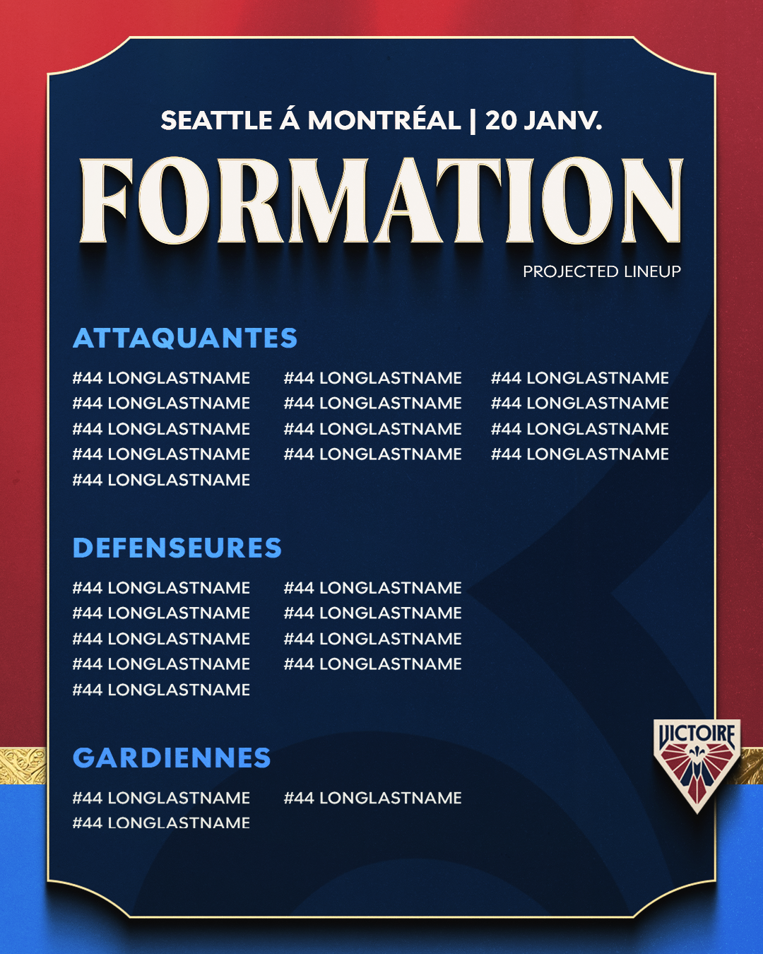
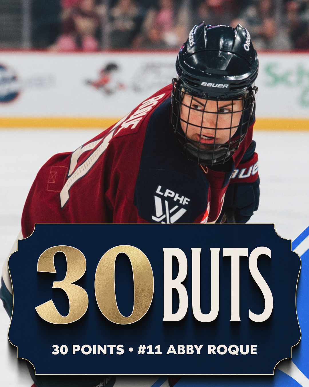
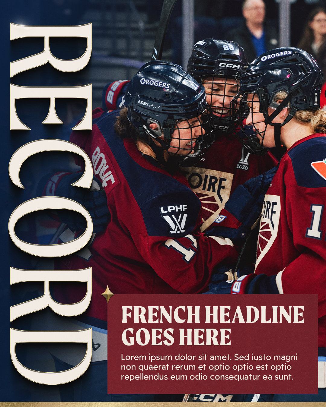
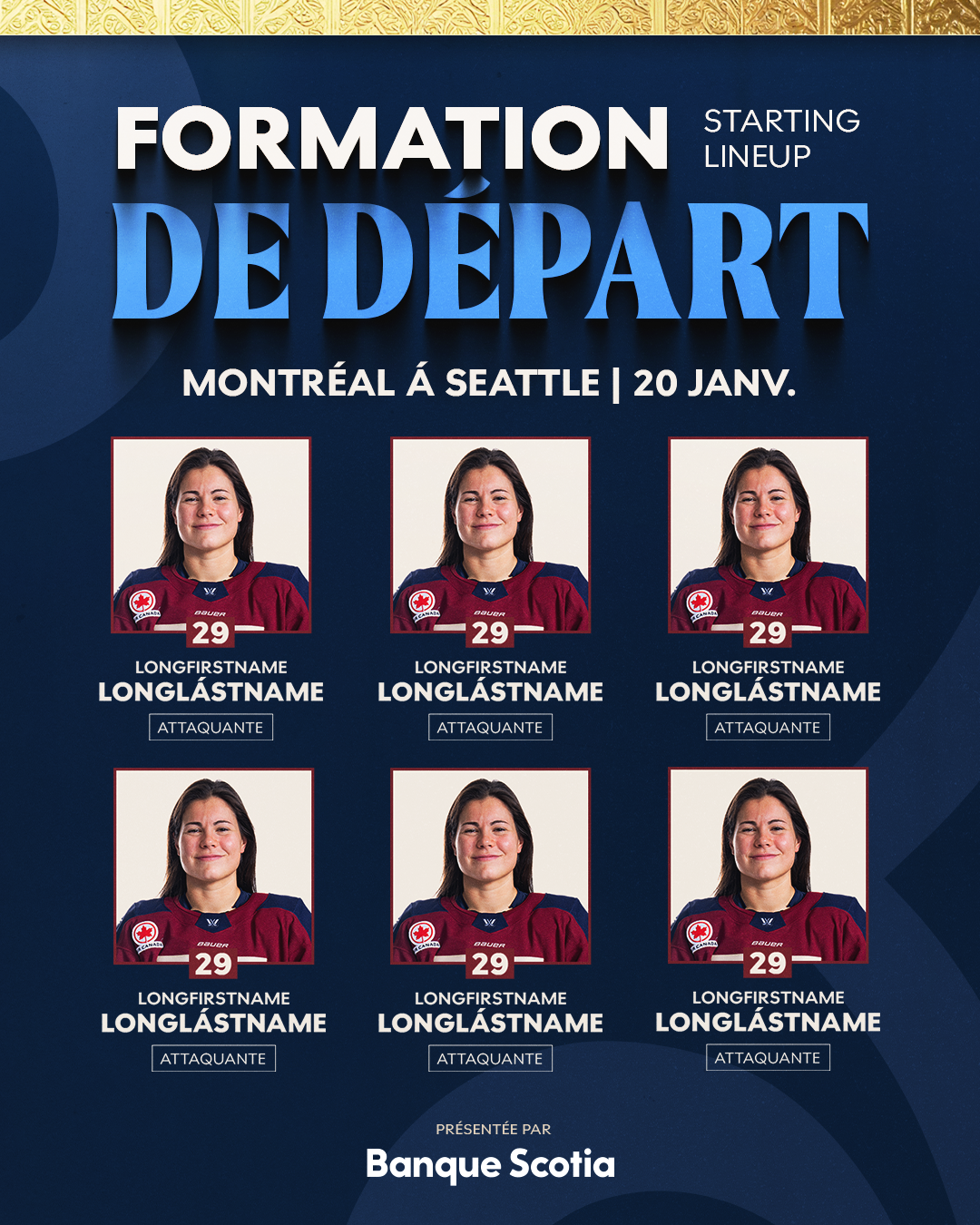
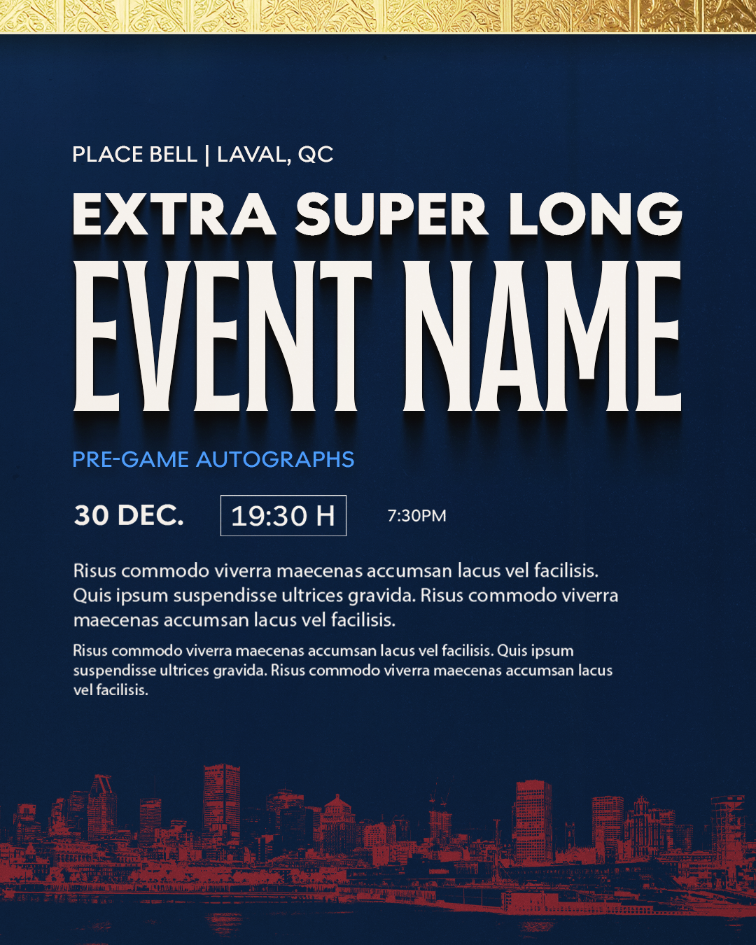
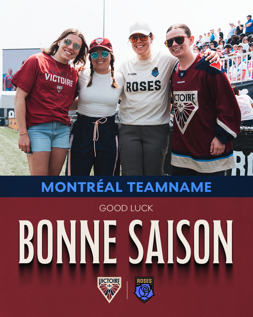
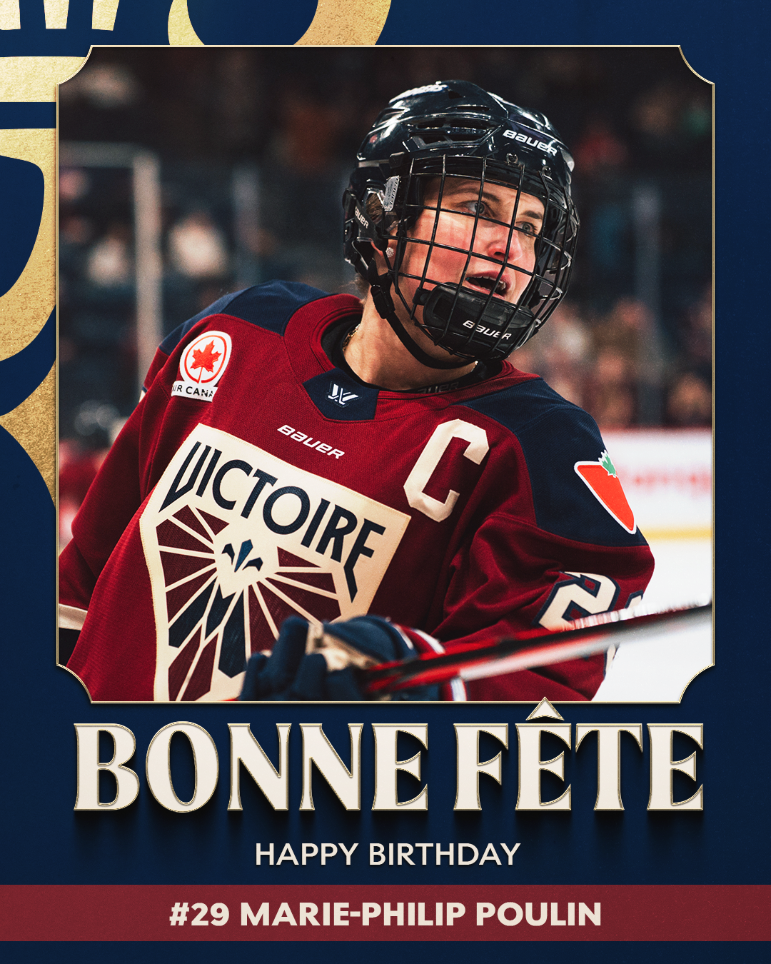
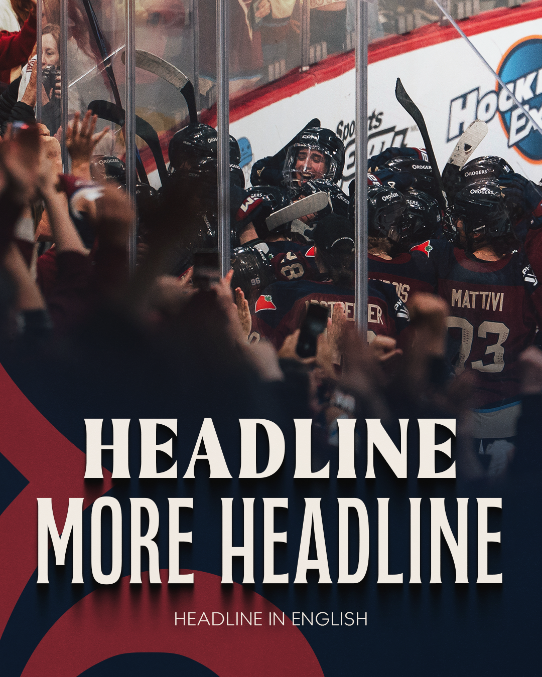
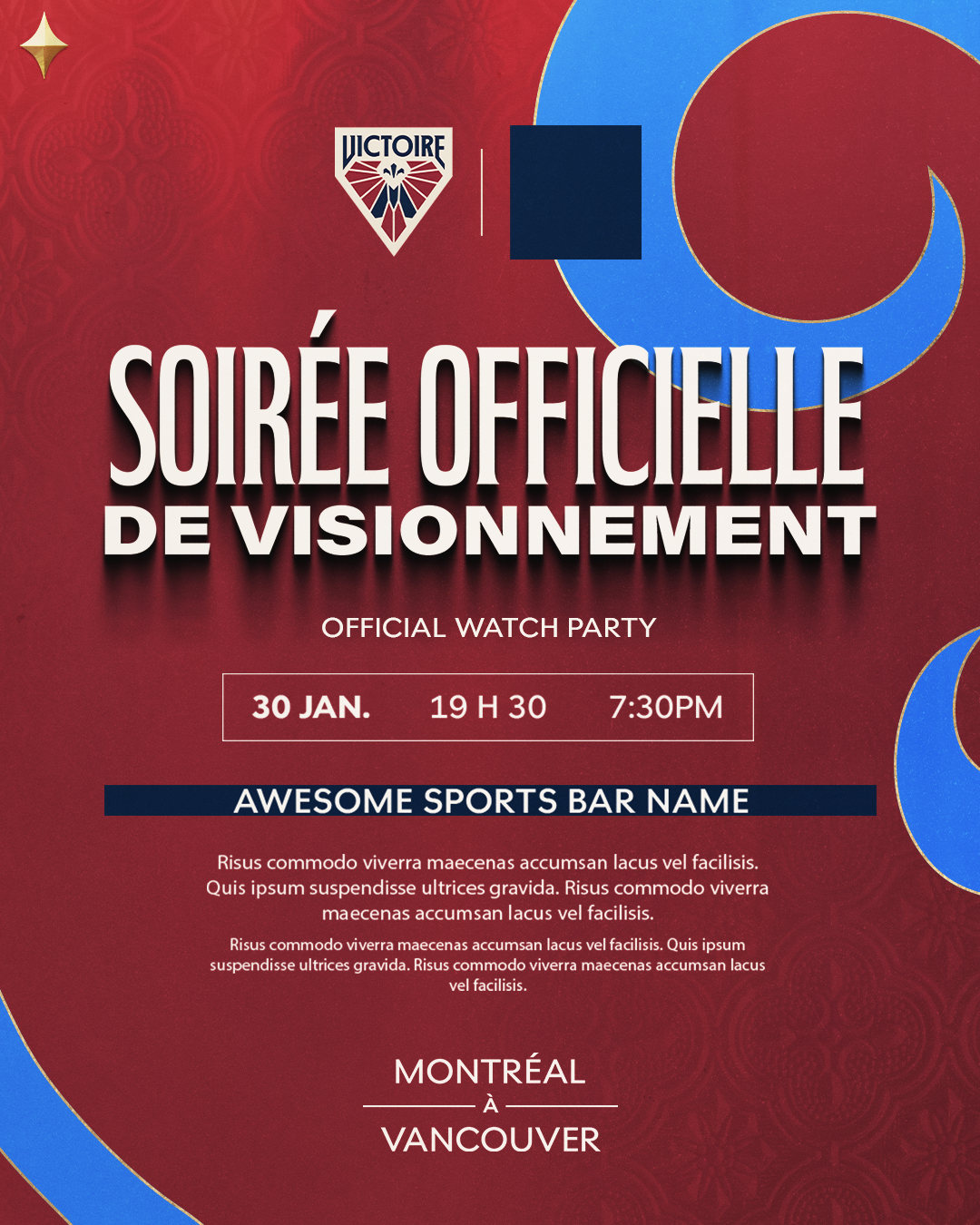
Built for the pace of game day, these templates balance bold layouts with an editable system that makes real-time content easy to turn around. Every design has to account for partner logos, long French titles, and English subheadings, so clear hierarchy and flexible spacing are essential to keeping everything readable without overcrowding the layout.
Note: These templates have not yet been deployed, so all content shown is placeholder copy.
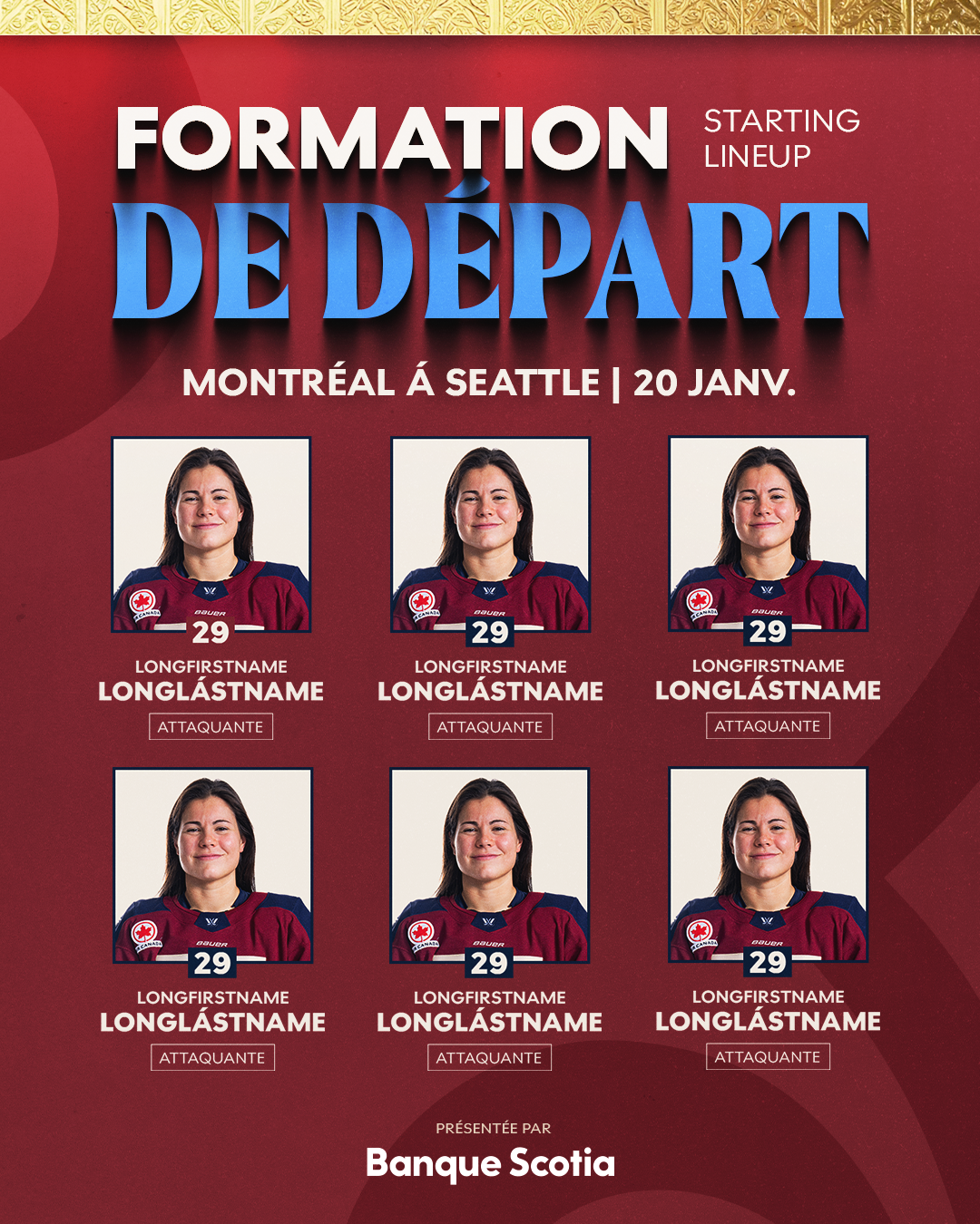
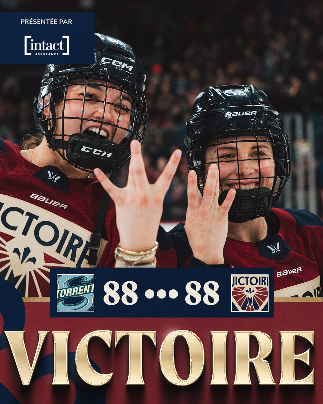
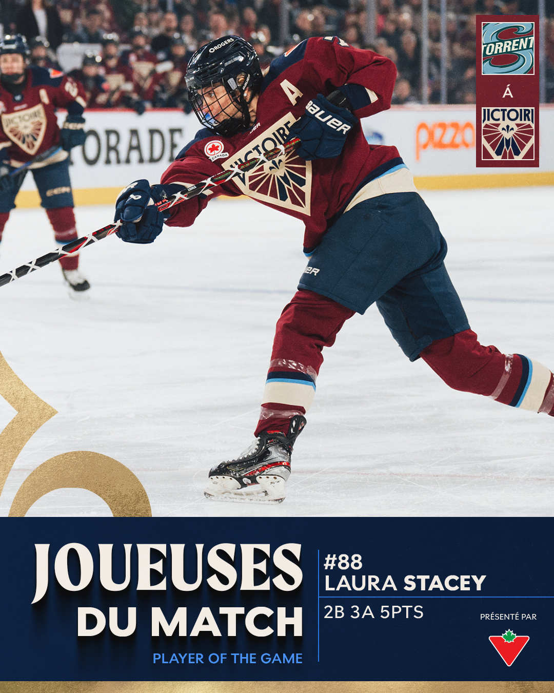
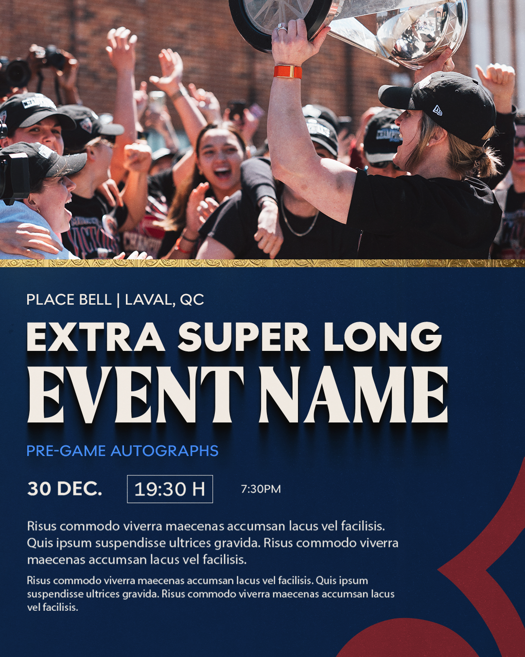
The Process
-
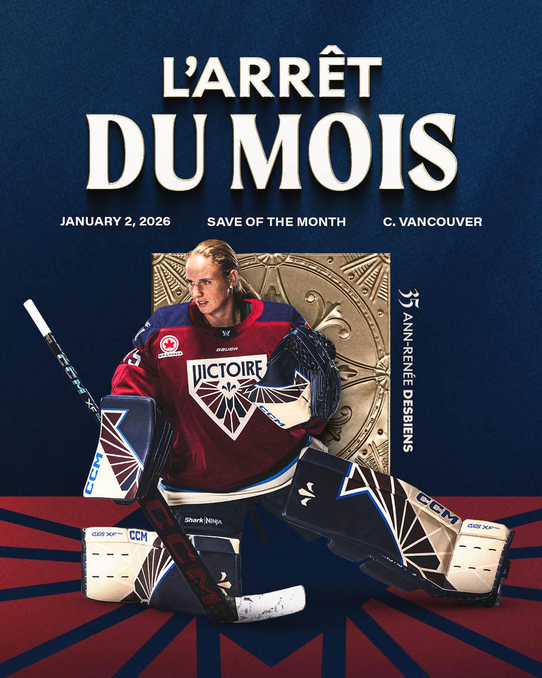
Bringing gold into the visual identity felt like a natural next step after Victoire’s Walter Cup win. At the same time, the team wanted to bring more of Montréal into the brand. I introduced landmarks inspired by the city’s architecture alongside ornate shapes and containers that nod to its rich history, giving the look a more elevated feel with a stronger sense of place.
-
The playoff look featured chrome lettering built around a gothic typeface we'd used throughout the season. For the next iteration, the team wanted something more legible, so I shifted to a typeface that is simple with a more refined, vintage feel. To carry the dimensional quality of the playoff graphics forward, I developed a gold-stroke treatment that gives the lettering a similar 3D effect without relying on the original typeface.
-
Inspired by Québec's fleur-de-lis motif, these simplified shapes form a secondary graphic layer throughout the identity. Rather than functioning as literal symbols, they add texture, structure, and visual rhythm to otherwise flat backgrounds. Selective gold and chrome treatments introduce additional depth while keeping the motifs firmly in a supporting role.